Hydejack's New Design
This post introduces Hydejack’s now background image, color palette and logo.
While v7 brings an insane amount of new stuff, the most notable change is the new background image. It is no longer anti-selling the theme. The old image was a blurred version of Napoleon Bonaparte, which was just… weird. I could tell the story of how this came to be, but I’d rather show you the new and improved background image.
New background image
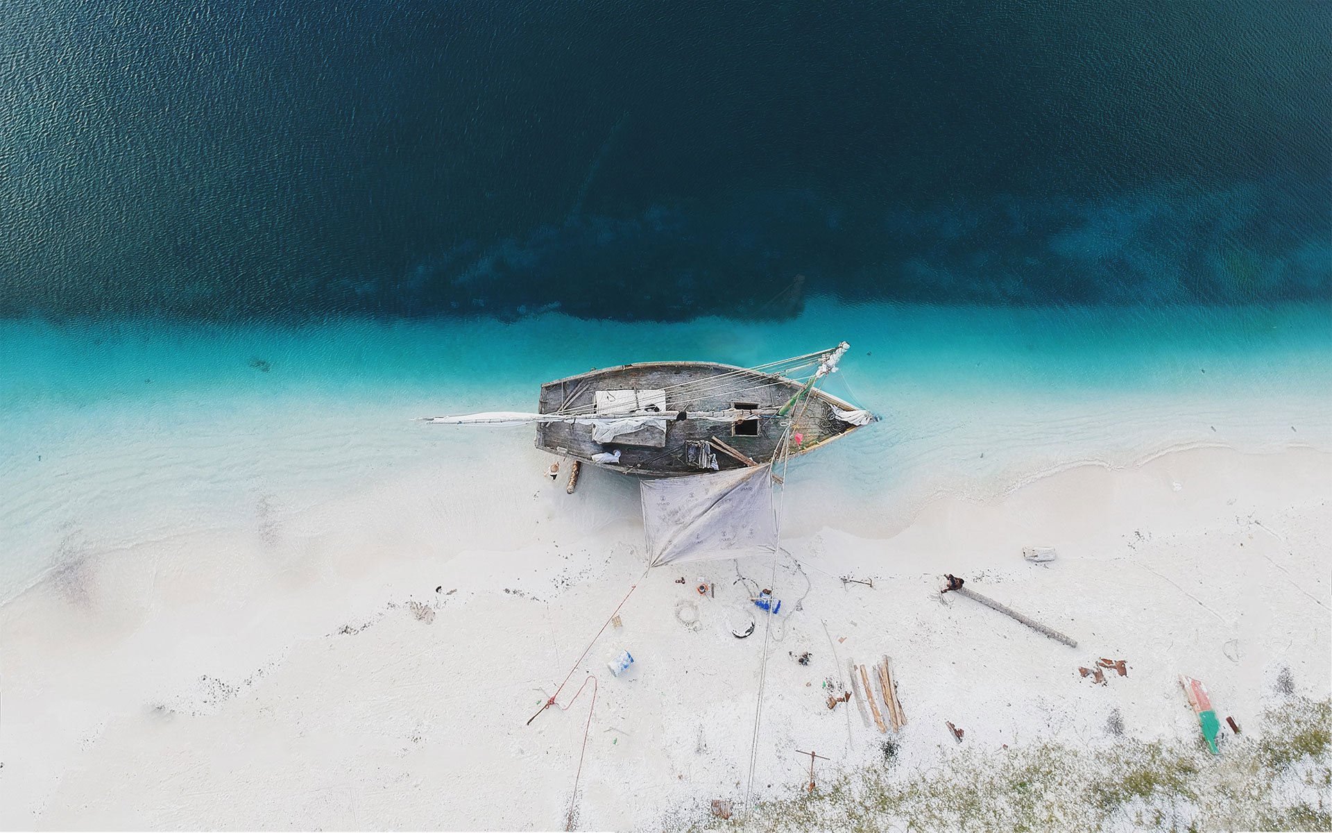
Yes, it’s an aerial shot of a beach (so hot right now).
 Hydejack’s new background image.
Q: What has this picture to do with Hydejack? Nothing really, I just like how it looks. However: Boat → Pirates → Hijacking → Hydejack (illuminati confirmed)
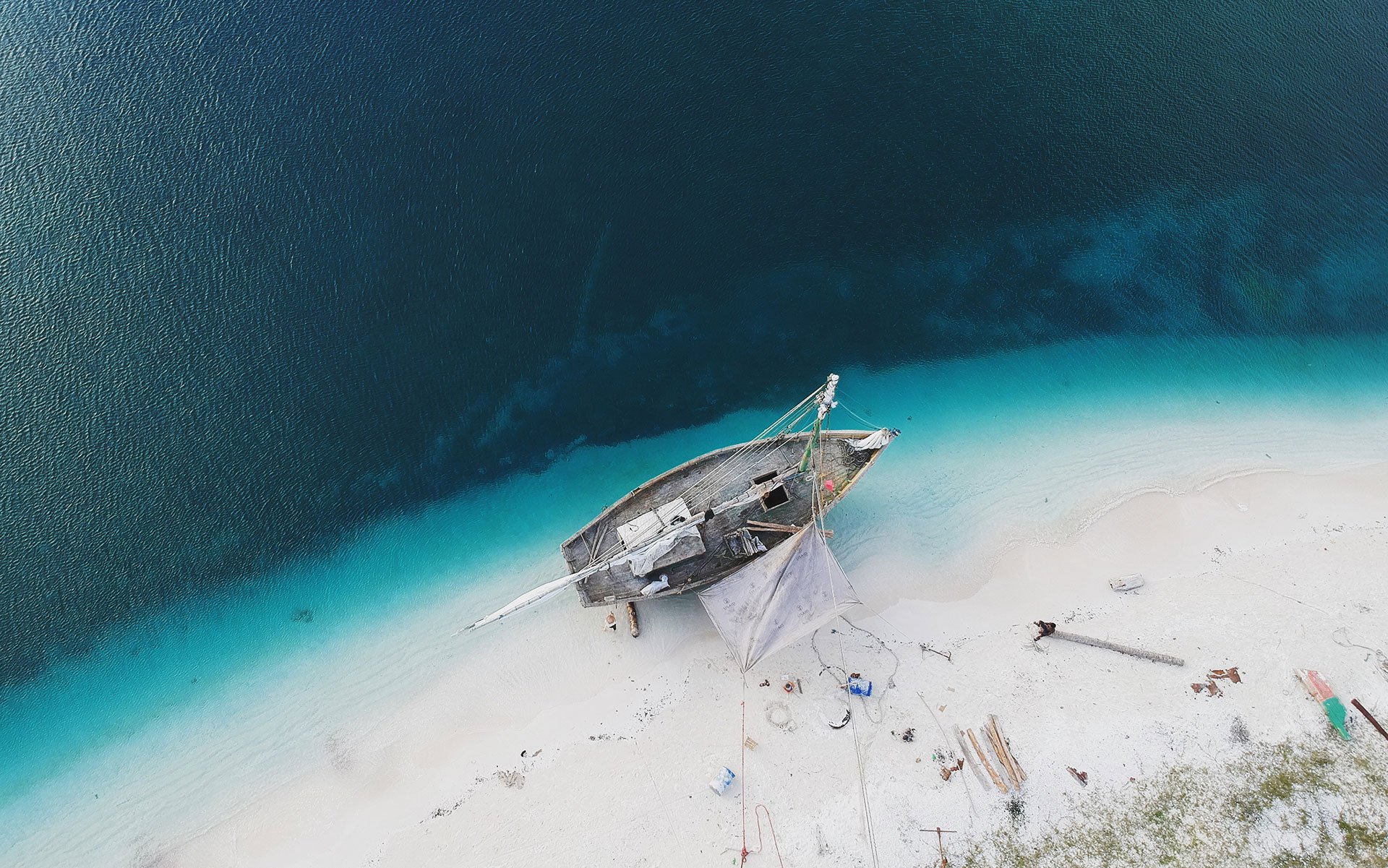
Even though it is a free image from Unsplash (…), it’s unique in the sense that I’ve modified it so it looks better inside the sidebar. Specifically, I’ve straightened out the beach and rotated the boat so that it sits at a nice 90 degree angle.
For comparison, here is the non-euclidean mess the original photo was. Pretty OCD, I know.
 The original photo before it was “straightened out” by applying Photoshop magic.
New color palette
I’ve extracted the major colors from the background image, which now form Hydejack’s color palette:

New logo
Hydejack also has a new logo, which is based on the new color palette. It also features the best font on Google Fonts, and probably the world: Roboto Slab (which is to say, I like it a lot).
![]()
